2018 NCAA Tournament Picks

Every year since 2010 I have used data science to predict the results of the NCAA Men’s Basketball Tournament. In this post I will describe the methodology that I used to create my picks (full bracket here). The model has Virginia, Michigan, Villanova, and Michigan State in the Final Four with Virginia defeating Villanova in the championship game:

Screen Shot 2018-03-13 at 9.20.05 PM

Here are my ground rules:

  • The picks should not be embarrassingly bad.
  • I shall spend no more than one work day on this activity (and 30 minutes for this post). This year I spent two hours cleaning up and running my code from last year.
  • I will share my code and raw data. (The data is available on Kaggle. The code is not cleaned up but here it is anyway.)

I used a combination of game-by-game results and team metrics from 2003-2017 to build the features in my model. Here is a summary:

I also performed some post-processing:

  • I transformed team ranks to continuous variables given a heuristic created by Jeff Sonos.
  • Standard normalization.
  • One hot encoding of categorical features.
  • Upset generation. I found the results to be not interesting enough, so I added a post-processing function that looks for games where the win probability for the underdog (a significantly lower seed) is quite close to 0.5. In those cases the model picks the underdog instead.

The model predicts the probability one team defeats another, for all pairs of teams in the tournament. The model is implemented in Python and uses logistic regression. The model usually performs well. Let’s see how it does this year!

2017 NCAA Tournament Picks

Every year since 2010 I have used analytics to predict the results of the NCAA Men’s Basketball Tournament. I missed the boat on posting the model prior to the start of this year’s tournament. However, I did build and run a model, and I did submit picks based on the results. Here are my model’s picks – as I write this (before the Final Four) these picks are better than 88% of those submitted to ESPN.

Here are the ground rules I set for myself:

  • The picks should not be embarrassingly bad.
  • I shall spend no more than one work day on this activity (and 30 minutes for this post).
  • I will share my code and raw data. (Here it is.)

I used a combination of game-by-game results and team metrics from 2003-2016 to build the features in my model. Here is a summary:

I also performed some post-processing:

  • I transformed team ranks to continuous variables given a heuristic created by Jeff Sonos.
  • Standard normalization.
  • One hot encoding of categorical features.
  • Upset generation. I found the results aesthetically displeasing for bracket purposes, so I added a post-processing function that looks for games between Davids and Goliaths (i.e. I compare seeds) where David and Goliath are relatively close in strength. For those games, I go with David.

I submitted the model to the Kaggle NCAA competition, which asks for win probabilities for all possible tourney games, where submissions are scored by evaluating the log-loss of actual results and predictions. This naturally suggests logistic regression, which I used. I also built a fancy pants neural network model using Keras (which means to run my code you’ll need to get TensorFlow and Keras in addition to the usual Anaconda packages). Keras produces slightly better results in the log-loss sense. Both models predict something like 78% of past NCAA tournament games correctly.

There are a couple of obvious problems with the model:

  • I did not actually train the model on past tournaments, only on regular season games. That’s just because I didn’t take the time.
  • Not accounting for injuries.
  • NCAA games are not purely “neutral site” games because sometimes game sites are closer to one team than another. I have code for this that I will probably use next year.
  • I am splitting the difference between trying to create a good Kaggle submission and trying to create a “good” bracket. There are subtle differences between the two but I will spare you the details.

I will create a github repo for this code…sometime. For now, you can look at the code and raw data files here. The code is in ncaa.py.

2016 NCAA Tournament Picks

Every year since 2010 I have used analytics to make my NCAA picks. Here is a link to the picks made by my model [PDF]: the projected Final Four is Villanova, Duke, North Carolina, and Virginia with Villanova defeating North Carolina in the final. (I think my model likes Virginia too much, by the way.)

Here’s how these selections were made. First, the ground rules I set for myself:

  • The picks should not be embarrassingly bad.
  • I shall spend no more than on this activity (and 30 minutes for this post).
  • I will share my code and raw data.

Okay: the model. The model combines two concepts:

  1. A “win probability” model developed by Joel Sokol in 2010 as described on Net Prophet.
  2. An eigenvalue centrality model based on this post on BioPhysEngr Blog.

The win probability model accounts for margin of victory and serves as preprocessing for step 2. I added a couple of other features to make the model more accurate:

  • Home-court advantage is considered: 2.5 points which was a rough estimate I made a few years ago and presumably is still reasonable.
  • The win probability is scaled by an adjustment factor which has been selected for best results (see below).
  • Recency is considered: more recent victories are weighted more strongly.

The eigenvalue centrality model requires game-by-game results. I pulled four years of game results for all divisions from masseyratings.com (holla!) and saved them as CSV. You can get all the data here. It sounds complicated, but it’s not (otherwise I wouldn’t do it) – the model requires less than 200 lines of Python, also available here. (The code is poor quality.)

How do I know these picks aren’t crap? I don’t. The future is uncertain. But, I did a little bit of backtesting. I trained the model using different “win probability” and “recency” parameters on the 2013-2015 seasons, selecting the combination of parameters that correctly predicted the highest percentage of NCAA tournament games during those seasons, getting approximately 68% of those games right. I don’t know if that’s good, but it seems to be better than applying either the eigenvalue centrality model or the win probability model separately.

In general, picks produced by my models rank in the upper quartile in pools that I enter. I hope that’s the case this year too.

Predicting the NCAA Tournament Using Monte Carlo Simulation

I have created a simulation model in Microsoft Excel using Frontline Systems’ Analytic Solver Platform to predict the 2014 NCAA Tournament using the technique I described in my previous post.

Click here to download the spreadsheet.

To try it out, go to solver.com and download a free trial of Analytic Solver Platform by clicking on Products –> Analytic Solver Platform:

image

Once you’ve installed the trial, open the spreadsheet. You’ll see a filled-out bracket in the “Bracket” worksheet:

image

Winners are determined by comparing the ratings of each time, using Excel formulas. Basically…a bunch of IF statements:

image

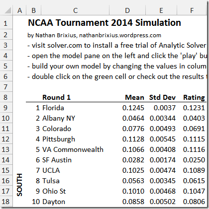
The magic of simulation is that it accounts for uncertainty in the assumptions we make. In this case, the uncertainty is my crazy rating system: it might be wrong. So instead of a single number that represents the strength of, say, Florida, we actually have a range of possible ratings based on a probability distribution. I have entered these probability distributions for the ratings for each team in column F. Double click on cell F9 (Florida’s rating), and you can see the range of ratings that the simulation considers:

image

The peak of the bell curve (normal) distribution is at 0.1245, the rating calculated in my previous post. Analytic Solver Platform samples different values from this distribution (and the other 63 teams), producing slightly different ratings, over and over again. As the ratings jiggle around for different trials, different teams win games and there are different champions for these simulated tournaments. In fact, if you hit F9 (or the “Calculate Now” button in the ribbon), you can see that all of the ratings change and the NCAA champion in cell Y14 sometimes changes from Virginia to Florida to Duke and so on.

Click the “play” button on the right hand side to simulate the NCAA tournament 10,000 times:

image

Now move over to the Results worksheet. In columns A and B you see the number of times each team won the simulated tournament (the sum of column B adds up to 10,000):

image

There is a pivot table in columns E and F that summarizes the results. Right click to Refresh it, and the nifty chart below:

image

image

We see that even though Virginia is predicted to be the most likely winner, Florida and Duke are also frequent winners.

What’s nice about the spreadsheet is that you can change it to do your own simulations. Change the values in columns D and E in the Bracket worksheet to incorporate your own rating system and see who your model predicts will win. The simulation only scratches the surface of what Analytic Solver Platform can do. Go crazy with correlated distributions (perhaps by conference?) or even simulation-optimization models to tune your model. Have fun.

NCAA Tournament Analytics Model 2014: Methodology

I revealed my analytics model’s 2014 NCAA Tournament picks in yesterday’s post. Today, I want to describe how the ratings were determined. (Fair warning: this post will be quite a bit more technical and geeky.)

Click here to download the Python model source code.

My NCAA prediction model computes a numerical rating for each team in the field. Picks are generated by comparing team ratings: the team with the higher rating is predicted to advance. As I outlined in my preview, the initial model combines two ideas:

  1. A “win probability” model developed by Joel Sokol in 2010 as described on Net Prophet.
  2. An eigenvalue centrality model based on this post on BioPhysEngr Blog.

The eigenvalue centrality model creates a big network (also called a graph) that links all NCAA teams. The arrows in the network represent games between teams. Eigenvalue centrality analyzes the network to determine which network nodes (which teams), are strongest. The model I described in my preview was pretty decent, but it failed to address two important issues:

  • Recently played games should count more than games at the beginning of the season.
  • Edge weights should reflect the probability one team is stronger than another, rather than probability one will beat another on a neutral floor.

The first issue is easy to explain. In my initial model, game-by-game results were analyzed to produce edge weights in a giant network linking teams. The weight was simply the formula given by Joel Sokol in his 2010 paper. However, it seems reasonable that more recently played games are more important, from a predictive perspective, than early season games. To account for this factor, I scale the final margin of victory for more recently played games by a “recency” factor R. If one team beats another by K points at the start of the season, we apply the Sokol formula with K. However, if one team beats another by K points at the end of the season, we apply the formula with R*K. If R=2, that means a 10 point victory at the start of the season is worth the same as a 5 point victory at the end. If the game was in the middle of the season, we’d apply half of the adjustment: 7.5 points.

The second issue – regarding edge weights and team strength – is more subtle. As you saw in the “Top 25” from my preview post, there were some strange results. For example, Canisius was rated #24. The reason is that the Sokol formula is not very sensitive to small margins of victory.

Let’s look at an example. Here is the Sokol formula: phi(0.0189 * x – 0.0756)

If you try the values 1..6 you get the probabilities [0.477, 0.485, 0.492, 0.5, 0.508, 0.515]. This means that the difference between a 1-point home win and a 6-point home win is only 0.515 – 0.477 = 0.0377 ~= 3%. This means that most of the nonzero values in the big adjacency matrix that we create are around 0.5, and consequently our centrality method is determining teams that are influential in the network, rather than teams that are dominant. One way to find teams that are dominant is to scale the margin of victory so that a 6-point victory is worth much more than a 1-point victory. So the hack here is to substitute S*x for x in the formula, where S is a “sensitivity” scaling factor.

One last tiny adjustment I made was to pretend that Joel Embiid did not play this year, so that Kansas’s rating reflects their strength without him. Long story short, I subtracted 1.68 points for all games that Joel Embiid appeared in. This post has the details.

My Python code implements everything I described in this post and the preview. I generated the picks by choosing the recency parameter R = 1.5 and strength parameter S = 2. Here is a sample call and output:

scoreNcaa(25, 20, 2, 1.5, 0)
['Virginia', 0.13098760857436742] ['Florida', 0.12852960094006807] ['Duke', 0.12656196253849666] ['Kansas', 0.12443601960952431] ['Michigan St', 0.12290861109638007] ['Arizona', 0.12115701603335856] ['Wisconsin', 0.11603580613955565] ['Pittsburgh', 0.11492421298144373] ['Michigan', 0.11437543620057213] ['Iowa St', 0.1128795675290855]

If you’ve made it this far, and have the source code, you can figure out what most of the other parameters mean. (Or you can ask in the comments!)

The answer to the question, “why did Virginia come out first” is difficult to answer succinctly. Basically:

  • Virginia, Florida, and Duke are all pretty close.
  • Virginia had a consistently strong schedule.
  • Their losses were generally speaking close games to strong opponents.
  • They had several convincing, recent victories over other very strong teams.
    In a future post, I will provide an Excel spreadsheet that will allow you to build and simulate your own NCAA tournament models!

NCAA Tournament Analytics Model 2014: Picks

Here are my picks for the 2014 NCAA Tournament, based on the analytics model I described in this post. This post contains the picks and my next post will contain the code and methodology for the geeks among us. I use analytics for my NCAA picks for my own education and enjoyment, and to absolve responsibility for them. No guarantees!

Here is a link to picks for all rounds in PDF format.

Here is a spreadsheet with all picks and ratings.

This year’s model examined every college basketball game played in Division I, II, III, and Canada based on data from Prof. Peter Wolfe and from MasseyRatings.com. The ratings implicitly account for strength of opposition, and explicitly account for neutral site games, recency, and Joel Imbiid’s back (it turned out not to matter). I officially deem these picks “not crappy”.

The last four rounds are given at the end – the values next to each team are the scores generated by the model.

The model predicts Virginia, recent winners of the ACC tournament, will win it all in 2014 in a rematch with Duke. Arizona was rated the sixth best team in the field but is projected to make it to the Final Four because it plays in the weakest region (the West). Florida, the second strongest team in the field (juuust behind Virginia) joins them. Wichita State was rated surprisingly low (25th) even though it is currently undefeated, basically due to margin of victory against relatively weaker competition (although the Missouri Valley has been an underrated conference over the past several years). Wichita State was placed in the Midwest region, clearly the toughest region in the bracket, and is projected to lose to underseeded Kentucky in the second round. Here is the average and median strengths of the four regions. The last column is the 75th percentile, which is an assessment of the strength of the elite teams in each bracket. Green means easy:

Region Avg Med Top Q
South 0.0824 0.0855 0.1101
East 0.0816 0.0876 0.1064
West 0.0752 0.0831 0.1008
Midwest 0.0841 0.0890 0.1036

The model predicts a few upsets (though not too many). The winners of the “play-in games” are projected to knock off higher seeded Saint Louis and UMass. Kentucky is also projected to beat Louisville, both of whom probably should have been seeded higher. Baylor is projected to knock off Creighton, busting Warren Buffett’s billion dollar bracket in Round 2.

Sweet 16     Elite 8  
Florida 0.1285   Florida 0.1285
VA Commonwealth 0.1097      
Syracuse 0.1111   Kansas 0.1281
Kansas 0.1244      
Virginia 0.1310   Virginia 0.1281
Michigan St 0.1229      
Iowa St 0.1129   Iowa St 0.1129
Villanova 0.1060      
Arizona 0.1212   Arizona 0.1212
Oklahoma 0.1001      
Baylor 0.1013   Wisconsin 0.1160
Wisconsin 0.1160      
Kentucky 0.1081   Kentucky 0.1081
Louisville 0.1065      
Duke 0.1266   Duke 0.1266
Michigan 0.1144      


Final Four     Championship
Florida 0.1285   Virginia 0.1310
Virginia 0.1310   Duke 0.1266
Arizona 0.1212      
Duke 0.1266      

Using Analytics to Assess Joel Embiid’s Injury and Kansas’s Chances

Joel Embiid is the starting center of the Kansas Jayhawks and one of the most talented college basketball players in the country. Unfortunately he suffered a stress fracture in his back and is likely to miss at least the first weekend of the upcoming NCAA tournament. Some think that Kansas is headed for an early round exit while others think that Kansas’s seed should not be affected at all. Can we use analytics, even roughly, to assess the impact on Kansas’ NCAA tournament prospects?

How about looking at win shares? A “win share” is a statistical estimate of the number of team wins that can be attributed to an individual’s performance. According to the amazing Iowa-powered basketball-reference.com, Embiid’s win shares per 40 minutes are an impressive 0.212 (an average player is around .100). HIs primary replacement, Tarik Black, is at 0.169. That’s a difference of 0.042 win shares per 40 minutes. I probably can’t technically do what I am about to do, but who cares. Since Kansas averages 80 points a game, the win share difference is 80 x 0.042 = 3.36 points per game. However, Embiid was only playing around 23 minutes a game, and Black isn’t even getting all of his minutes. Certain other teammates (Wiggins!) may simply play more minutes than usual to compensate. So 3.36 is probably on the high side. If we estimate that Embiid’s presence will be missed for only 20 player-minutes per game, an estimate of 1.68 points per game is probably reasonable. I will use this assumption in my upcoming NCAA Tournament model.

If we look at Kansas’s schedule we see that this difference would possibly only have swayed two games (Oklahoma State and Texas Tech). Embiid’s loss should not affect his team’s seeding any more than it already has by having lost to Iowa State in the Big 12 tournament. Kansas is a solid 2 seed, but Embiid’s loss, if prolonged, could delay a fifteenth Final Four appearance.

NCAA Tournament Analytics Model 2014 Preview

My NCAA Tournament Prediction Model posts have traditionally been pretty popular, so I thought I would put in a bit more effort this year. In this post I want to share some “raw materials” that you might find helpful, and describe the methodology behind this year’s model.

Here are some resources that you might find helpful if you want to build your own computer-based model for NCAA picks:

    This year I am going to combine two ideas to build my model. The first is a “win probability” model developed by Joel Sokol which is described on Net Prophet. As the blog post says, this model estimates the probability that Team A will beat Team B on a neutral site given Team A beat Team B at home by a given number of points. So for example if A loses to B by 40 at home, this probability is close to zero. You can hijack this model to assign a “strength of victory” rating: a blowout win is a greater show of team strength than a one-point thriller.

The second idea is a graph theoretical approach stolen from this excellent post on BioPhysEngr Blog. The idea here is to create a giant network based on the results of individual games. So for example if Iowa beats Ohio State then there are arrows between the Iowa and Ohio State nodes. The weight on the edge is a representation of the strength of the victory (or loss). Given this network we can apply an eigenvalue centrality approach. In English, this means determining the importance of all of the nodes in the network, which in my application means the overall strength of each team. I like this approach because it is easy for me to code: computing the largest eigenvalue using the power method is simple enough for even Wikipedia to describe succinctly. (And shockingly enough, according to the inscription on my Numerical Analysis text written by the great Ken Atkinson, I learned it twenty years ago!)

The difference between my approach and the BioPhysEngr approach is that I am using Sokol’s win probability logic to calculate the edge weights. As you’ll see when I post the code, it’s about 150 lines of Python, including all the bits to read in the game data.

I ran a preliminary version of my code against all college basketball games up until March 9, and my model’s Top 25 is given below. Mostly reasonable with a few odd results (Manhattan? Canisius? Iona?) I will make a few tweaks and post my bracket after the selection show on Sunday.


1

Wichita St

2

Louisville

3

Villanova

4

Duke

5

Kansas

6

Florida

7

Arizona

8

Virginia

9

Michigan St

10

North Carolina

11

Ohio State

12

Wisconsin

13

Manhattan

14

Syracuse

15

Iowa

16

Kentucky

17

Iona

18

Pittsburgh

19

Creighton

20

VA Commonwealth

21

Tennessee

22

Oklahoma St

23

Michigan

24

Canisius

25

Connecticut

NCAA Tournament Prediction Model 2013

(You might be interested to see the new and improved 2014 model. Click here to check it out.)

I wrote a computer program to rate the strength of every NCAA men’s college basketball team based on the Iterative Strength Rating algorithm. Last post I previewed it and and now I am presenting my picks for the 2013 NCAA Tournament.

Summary

Peter Wolfe at UCLA has graciously provided scores for every single college basketball game (over 21,000), found here. I used this information to produce a rating for each team. I then produced a bracket by simply choosing the team with the higher rating.

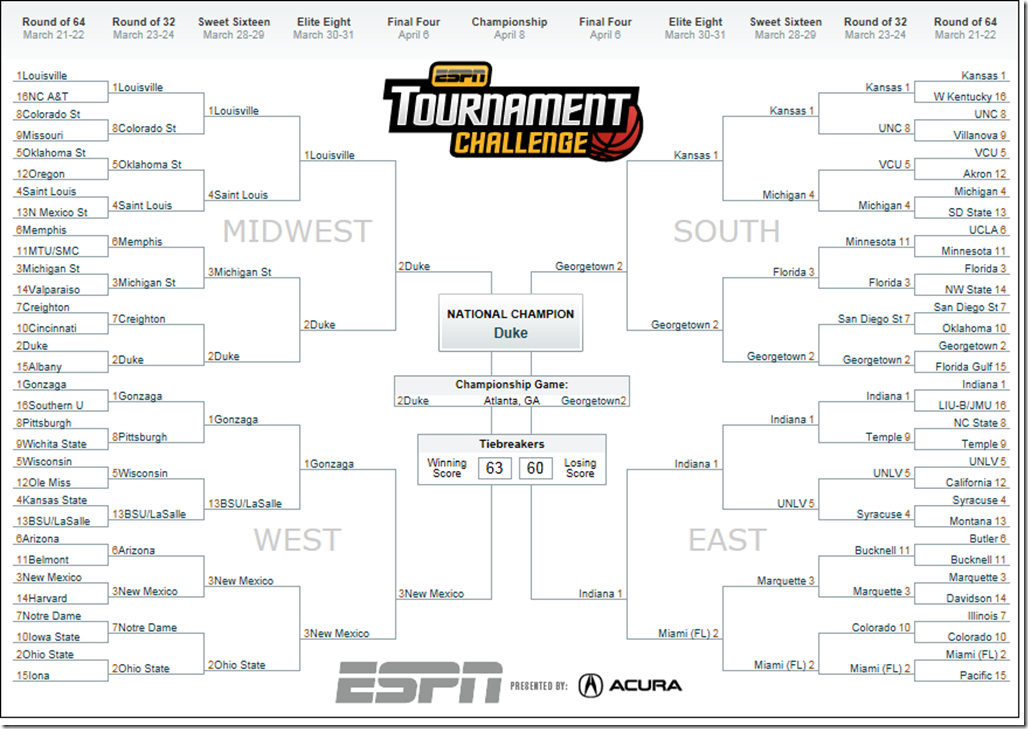
My complete bracket is below: click to enlarge. Check my progress or lack thereof once the tournament starts by clicking here.

NCAA

My Final Four is:

  • Midwest: Duke beats Louisville
  • West: New Mexico beats Gonzaga
  • South: Georgetown beats Kansas
  • East: Indiana beats Miami FL

with Duke beating Georgetown in the championship game. Notable upsets include Boise State defeating Arizona and Wisconsin, Bucknell defeating Butler, and Minnesota beating UCLA. The bracket is interesting in the sense that it is reasonable but the higher seed is not always selected.

Methodology

Now, the gory details. I’ve based my rating on the Iterative Strength Rating by Boyd Nation. Here’s how ISR works. First, give each team an equal rating, say 1.0. Next, go through each game and give each time some points. The winning team gets the rating of the losing team plus a “winning bonus” of 0.25. The losing team gets the rating of the winning team minus a penalty of 0.25. Once all of the games have been scored, we can update ratings for each team by dividing the team’s total score by the number of games played. Now, we can rescore the games using the updated ratings again and again until the scores stabilize. The Net Prophet blog shows that this is a pretty good way to rate teams. (By the way: I highly recommend this blog. Scott Turner has done an amazing job evaluating a number of different approaches, all using freely available software. Kudos Scott!)

This year, I created my own variant of ISR. There are two main modifications. First, I am accounting for margin of victory. How? In a 2006 paper by Paul Kvam and Joel Sokol, the authors derive an expression for the probability that Team A will defeat Team B, given that Team A beat Team B by x points on Team’ A’s home court:

RH(x) = exp(0.292 x - 0.6228) / (1 + exp(0.292 x - 0.6228))

This function levels off as the margin gets higher: the values for x=21 and x=20 are almost identical and close to 1. This function is also an indirect measure of strength of victory. Given the score of a game, and taking into account the home floor, we can evaluate this function and scale the “winning bonus” – so a large margin of victory will result in a winning bonus greater than 0.25 and a smaller margin of victory will result in a smaller winning bonus.

The second variation is to weight games differently. I divide the season into three segments:

  • The first 10 games,
  • The next 10 games,
  • The rest of the season.

The segments have weights: [0.8, 1.0, 1.2]. Why? Because I felt like it: games later in the season are probably a better predictor. A better approach is to find optimized weights based on tournament predictive power. After each modified ISR iteration I renormalize team ratings so they are in the range [0, 1]. Effectively this means I compute three scores for each team instead of one, but I don’t think this screws up the predictive power of the model too much given the number of observations per team (around 30).

I ran the algorithm on the complete set of 2012-2013 college basketball games, found here courtesy of Peter Wolfe of UCLA. This list is exhaustive and includes NAIA schools, Canadian schools, exhibition games, the Washington Generals, cats and dogs living together, etc. I’m not sure the teams are fully connected, so I do a pass through all of the games once, excluding exhibitions to identify a cluster of top-tier teams (presumably all Division I and II). The algorithm is about 140 lines of Python including the code to read the data. No fancy stuff. I will post the code later.

I have been doing little NCAA models like this for a few years now, and this is the first one I am proud of. We’ll see how it does. The main difference, of course, is that I am looking at individual games rather than aggregate team statistics over a season. A colleague of mine sometimes quotes the Papa John’s slogan “Better Ingredients, Better Pizza” when referring to the use of more granular data in models. I hope this year’s pizza tastes as good as it smells. (No endorsement implied…)

NCAA Tournament Prediction Model 2013 Preview

It’s NCAA Tournament selection Sunday! As in past years, I am going to write a program to make my picks following two principles: code it fast and do something reasonable. I am ahead of the game this year – I’m done!

The approach I am using is a modified version of the Iterative Strength Rating as described on the Net Prophet blog. I am making two modifications:

  • Incorporate margin of victory.
  • Weight late-season games more than early-season games.

I ran a preliminary version of the code on games played through March 17 (note: post updated 3/18 to include games from the last week). The model seeds the teams as follows. Let’s see how close these seeds are to the actual ones released this afternoon!

1 Louisville
1 Duke
1 Indiana
1 Miami FL
2 Kansas
2 Ohio State
2 Georgetown
2 Florida
3 Michigan
3 St Louis U.
3 Michigan St
3 New Mexico
4 Oklahoma St
4 Gonzaga
4 Marquette
4 Syracuse