Box plots are widely used among data scientists and statisticians. They’re useful because they show variation both between and within data series. R, Python’s matplotlib, and many other charting libraries support box plots right out of the…box, but Excel does not. In Excel 2013, with a little bit of imagination you can create nice looking box plots without writing any code. (If you are looking for a more comprehensive reference for charts and graphs in Excel, I recommend this book.)
Read this post to find out how to create box plots that look like this:
Here is a workbook that has the finished product if you don’t want to follow along.
You’ll need to start with a table containing the data you want to plot. I am using the data from the Michelson-Morley experiment:
A box plot shows the median of each data series as a line, with a “box” whose top edge is the third quartile and whose bottom edge is the first quartile. Often we draw “whiskers” at the top and bottom representing the extreme values of each series.
If we create an auxiliary data containing this data and follow my advice from my Error Bars in Excel post, we can create a nice looking box plot.
Step 1: Calculate Quartiles and Extremes.
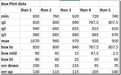
Create another table with the following rows for each series: min, q1, q2, q3, max. These will be the primary data in your box plot. Min and max are easy – use the =MIN() and =MAX() formulas on each data series (represented as columns A – E in my example). To compute Q1-Q3 use the QUARTILE.INC() function. (INC means “inclusive”. QUARTILE.EXC() would work fine if that’s what you want.) Enter the formulas for the first series and then “fill right”:
Step 2: Calculate box and whisker edges
We are going to create a stacked column chart with error bars, and “hide” the bottommost column in the stack to make the chart look like a box plot. Therefore we have to calculate the tops and bottoms of our boxes and whiskers:
- The bottom of each box is Q1.
- The ‘middle’ of each box is Q2 (the median). Since this is a stacked column chart, we actually want to compute Q2 – Q1.
- The top of each box is Q3. Since we want to represent this as a “slice” in the stacked column chart, we want Q3 – Q2.
- The error going “down” in the chart is Q2 – min, since the whiskers start at the median.
- The error going “up” is max – Q2.
Compute these five quantities as rows and you’ll have this:
Step 3: Create a stacked column chart.
Go to the INSERT tab and select a stacked column chart:
Now right click on the blank chart, choose Select Data Range and select the “box lo, box mid, mix hi range” as your data:
Step 4: Make the chart look like a Box Plot.
This is simple: the bottom bar (the blue ones in my example) need to go away. So right click on a blue bar and change both the outline and fill to nothing.
Step 5: Add Whiskers.
Follow the steps in my celebrated “Add Error Bars” post. Click on the “+” next to the chart, select Error Bars. Choose Series 2 (which corresponds to the median). Click on “More options” in the Error Bars flyout menu next to the “+”. In the task pane on the right, for Error Amount choose Custom and then click the Specify Value button:
For “Positive Error Value” select the “err up” row and for “Negative Error Value” select “err down”. Both rows contain positive values, and that is totally fine. Here’s what mine looks like:
That’s it! You can of course customize the other bars as desired.


Any way to put the whiskers or error bars behind the boxplots? (stacked diagrams)
2 Questions:
1) Any idea how to put the error bars behind the boxplots? (looks better in terms of design)
2) Do you have an easy way to add “averages/means” to the boxplots?
For those of you still looking for an answer to this, check out http://www.dummies.com/how-to/content/boxandwhisker-charts-for-excel.html. You create two separate custom value error bars. One will be q1 – min and the other will be max – q3.
This might be rather late, but one partial workaround is to increase the error bars’ transparency.
Chart Tools > Format > Select the error bar series from the dropdown > Shape Outline > More outline colors > Adjust transparency at the bottom
OMG THANK YOU
Thanks a million Nathan .. this was a life saver for me last night! Awesome work
Thanks for posting this Nathan – it was extremely clear and easy to follow.
I like the resulting box & whisker plots, except that my error bars reveal small, extra ‘caps’ that are probably the sum of intermediary error values. In other words, the error bar isn’t smooth between the q3 (or q1) and the final upper/lower caps. How can I suppress the appearance of these unwanted “minor caps”?
Also, I join with “listentomirf” in her/his first question posted 08 july 2014. How can I make the error bars invisible between q1 and q3?
Thank You a ton for this detailed, comprehensive, and easy to follow guide.
Ótimo, muito obrigada por divulgar seu conhecimento. Parabéns pelo site!!
Great, thank you for publishing your knowledge. Congratulations on your site !!
Great tutorial!
Okay, twelve positive karma points to you for posting this great little tutorial. Thanks!
I would like to use the data in an Excel book. Can you please contact me?